

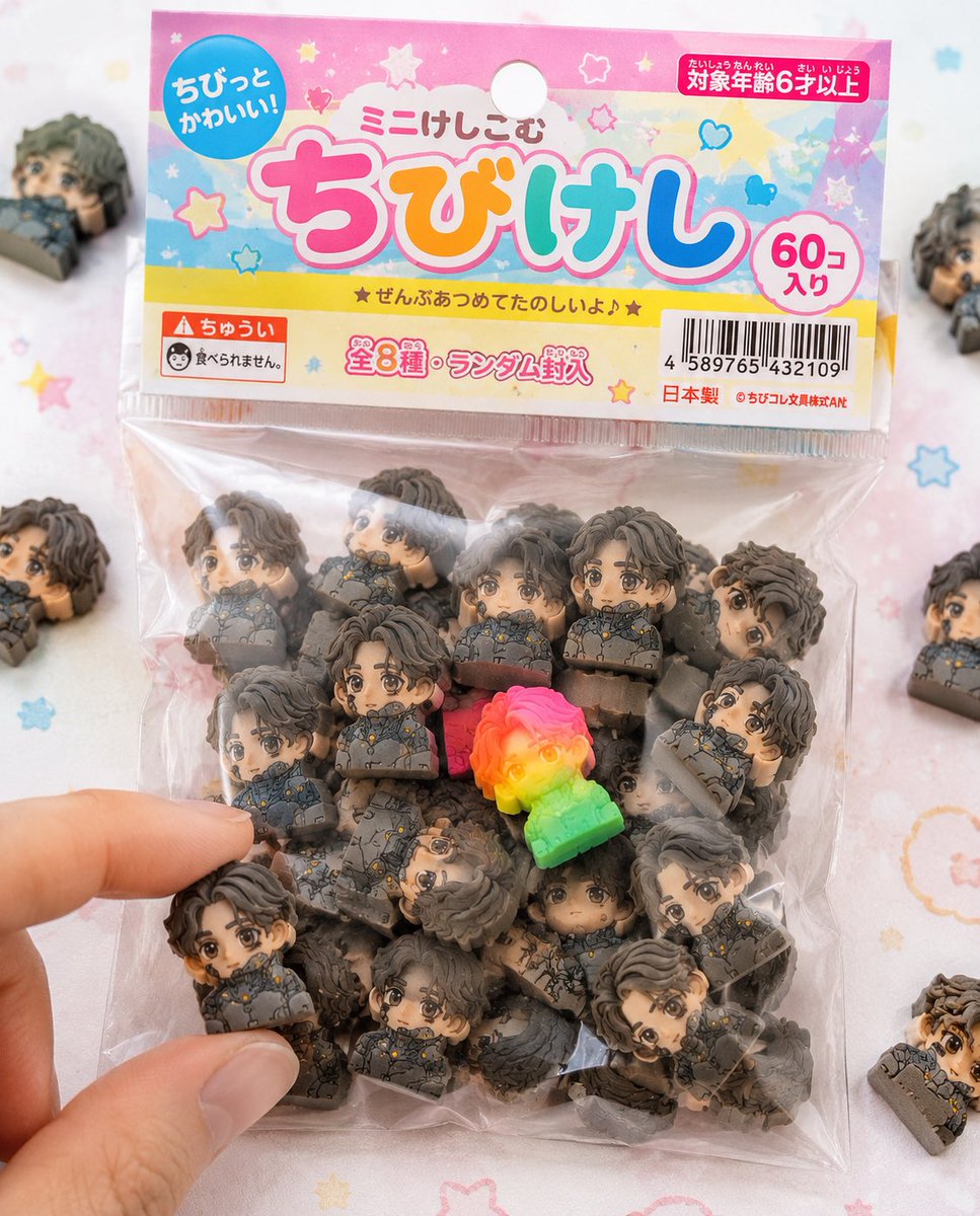
Use the attached character sheet as a STRICT design reference. Do not change the face, hairstyle, eye shape, or proportions under any circumstances.

■ Purpose: To fully commercialize the character as a Japanese "[product name]" and create realistic packaged product photos like those sold in stationery stores or gashapon machines.

■ Concept: "Bagged chibi eraser products sold in 100-yen shops and stationery stores."

■ Eraser Main Body: (Maintain exact same specs as before) - Strongly deformed chibi character - Thick block shape - Fully matte rubber material - Fine particles/powder/chips/wear present - Print misalignment/color variations - Random configuration of 50+ items.

■ Packaging (CRITICAL): - Small transparent plastic bag (OPP bag) - Paper header at the top (with hanging hole) - Slightly cheap printing on the header (slight misalignment/ink unevenness) - Wrinkled vinyl, slightly cloudy, sticking to contents due to static - Some air inside causing bulging - Light warping on the sealed section.

■ Graphic Design: - Japanese children's stationery style - Pop and colorful ([color theme] base) - Handwritten-style or rounded fonts - Product logo (original okay) - Text like 'Mini-Keshi' or 'Chibi-Keshi' - Stars, hearts, sparkle decorations.

■ Informational Elements (Enhanced Realism): - JAN code (barcode) - 'Ages 6 and up' - 'Not edible' warning - 'Total X types' or 'Randomly included' - Small company name (fictional) - MADE IN JAPAN or CHINA markings.

■ Composition: - Packaging is main in center of frame - A few spilled erasers around - 1 or 2 out of the bag - A fingertip picking one up for effect - Natural feel with some frame-out.

■ Rare Element: - Mix in one special individual with fluorescent color or gradient - Place in a prominent position to guide the viewer's gaze.

■ Lighting: - Bright natural light (slightly high-key) - Soft shadows - Cleanliness like a product catalog photo.

■ Camera: - Macro-leaning - Shallow depth of field - Sharp center.

■ Background: - White to pastel table - Subtle dots or pop patterns - Simple and clean.

■ Prohibited: - Plastic feel - glossy expression - Overly high-end texture (cheapness is correct) - Overly perfect printing.

■ Output: - A level indistinguishable from real products - Reality like items found in convenience stores or 100-yen shops - Quality that makes people on SNS say 'I want this.'


0 Comments
👥 Co-learning Circle 0
Observe other members' variables & configurations, and click "Study & Retry" to instantly import settings and practice!