

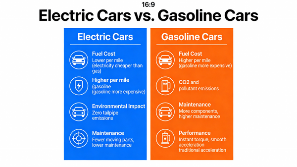
A visual comparison chart (a “vs.” infographic) comparing electric cars and gasoline cars. The chart should have two columns, with icons and brief text comparing them on factors like Fuel Cost, Environmental Impact, Maintenance, and Performance. The design should be clean, modern, and easy to understand at a glance, demonstrating the ability to visually organize and present comparative data. –ar 16:9


0 Comments
👥 Co-learning Circle 0
Observe other members' variables & configurations, and click "Study & Retry" to instantly import settings and practice!