

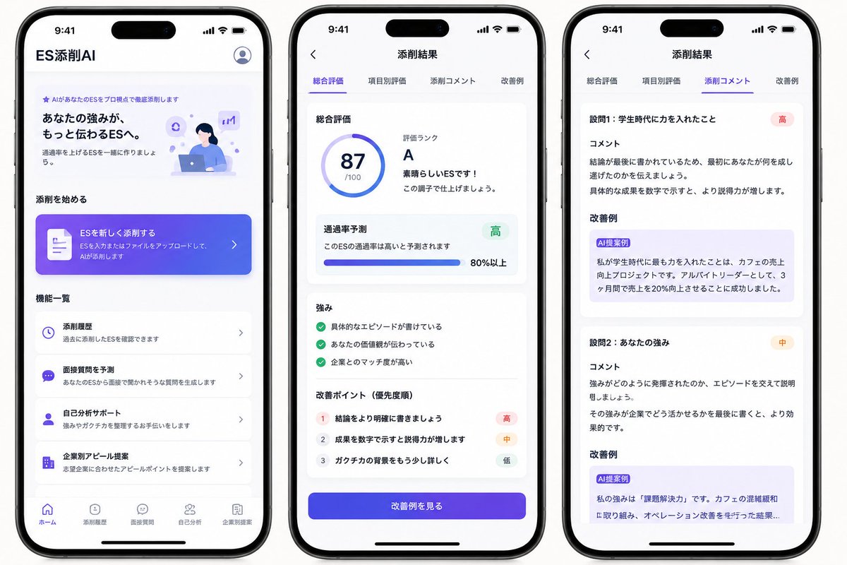
Goal: Create a polished marketing mockup for a Japanese mobile app called [app name], an AI entry-sheet/resume critique app for students, shown as three iPhone-style screens side by side on a clean white background.

Canvas: Wide horizontal image, approximately 16:9. Place exactly 3 black-framed modern iPhones with rounded corners, top Dynamic Island, status bar time 9:41, and bottom home indicator. Use bright white UI cards, soft shadows, rounded corners, and a purple-to-blue gradient accent style. Overall look should be like a realistic App Store/SNS concept mockup, clean and trustworthy.

Phone 1, Home screen: Header text at top left reads 「ES添削AI」, with a circular user/profile icon at top right. Hero section includes a small purple sparkle label 「AIがあなたのESをプロ視点で徹底添削します」, a bold headline 「あなたの強みが、もっと伝わるESへ。」, supporting copy 「通過率を上げるESを一緒に作りましょう。」, and a small illustration of a student working on a laptop with purple AI/chat icons. Section title 「添削を始める」. Add one large gradient call-to-action card with a document icon, text 「ESを新しく添削する」 and smaller copy 「ESを入力またはファイルをアップロードして、AIが添削します」 plus a right chevron. Section title 「機能一覧」. Show exactly 4 feature list cards: 1) clock icon, 「添削履歴」, 「過去に添削したESを確認できます」; 2) chat icon, 「面接質問を予測」, 「あなたのESから面接で聞かれそうな質問を生成します」; 3) person icon, 「自己分析サポート」, 「強みやガクチカを整理するお手伝いをします」; 4) building icon, 「企業別アピール提案」, 「志望企業に合わせたアピールポイントを提案します」. Bottom navigation contains exactly 5 items: 「ホーム」 active, 「添削履歴」, 「面接質問」, 「自己分析」, 「企業別提案」.

Phone 2, Results overview screen: Top bar has a back arrow and centered title 「添削結果」. Under it, show exactly 4 tabs: 「総合評価」 active with purple underline, 「項目別評価」, 「添削コメント」, 「改善例」. Main white card title 「総合評価」. Left side has a circular score ring showing [score] and 「/100」. Right side text reads 「評価ランク」, large rank [grade], 「素晴らしいESです!」, and 「この調子で仕上げましょう。」. Next card title 「通過率予測」, text 「このESの通過率は高いと予測されます」, green badge 「高」, horizontal progress bar, and 「80%以上」. Next card title 「強み」 with exactly 3 green check items: 「具体的なエピソードが書けている」, 「あなたの価値観が伝わっている」, 「企業とのマッチ度が高い」. Next card title 「改善ポイント(優先度順)」 with exactly 3 numbered rows: 1 「結論をより明確に書きましょう」 with red badge 「高」; 2 「成果を数字で示すと説得力が増します」 with orange badge 「中」; 3 「ガクチカの背景をもう少し詳しく」 with gray badge 「低」. At bottom, a large purple-blue gradient button reads 「改善例を見る」.

Phone 3, Detailed comments screen: Top bar has a back arrow and centered title 「添削結果」. Repeat exactly 4 tabs: 「総合評価」, 「項目別評価」, 「添削コメント」 active with purple underline, 「改善例」. Show exactly 2 visible critique sections in stacked white cards. Section 1 heading 「設問1:学生時代に力を入れたこと」 with red badge 「高」, subheading 「コメント」, comment text explaining that the conclusion is written last and should first communicate what the student accomplished, and that numerical results improve persuasiveness. Then subheading 「改善例」 with a light purple suggestion box labeled 「AI提案例」 containing rewritten Japanese text about focusing on increasing sales at a cafe, working as an part-time leader, and increasing sales by 20% in 3 months. Section 2 heading 「設問2:あなたの強み」 with orange badge 「中」, subheading 「コメント」, comment text explaining to support how the strength was demonstrated with an episode and to end with how it can be used at the company. Then subheading 「改善例」 with a light purple suggestion box labeled 「AI提案例」 containing a rewritten example beginning 「私の強みは『課題解決力』です。」 and mentioning cafe congestion and improving operations, cropped slightly at the bottom as if scrollable.

Visual style: Japanese iOS app UI, San Francisco/Noto Sans style typography, purple and indigo gradients, subtle pastel lavender highlights, blue accent icons, soft card shadows, crisp alignment, plenty of white space. Use realistic phone hardware shadows and spacing. Keep text legible and mostly identical to the specified Japanese labels.

Constraints: Show exactly 3 phones, exactly 4 home feature cards, exactly 5 bottom navigation items on the first phone, exactly 4 tabs on each results screen, exactly 3 strengths, exactly 3 improvement points, and exactly 2 visible comment sections. Do not add extra screens, watermarks, logos, or decorative clutter.


0 Comments
👥 Co-learning Circle 0
Observe other members' variables & configurations, and click "Study & Retry" to instantly import settings and practice!